
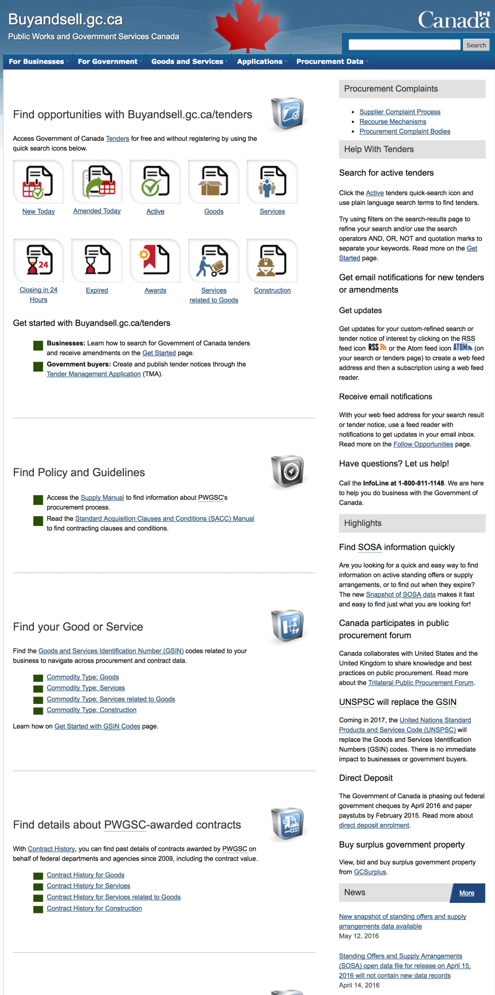
Buyandsell.gc.ca homepage reworked top to bottom
Tenders quick search icons
When government tenders were added to Buyandsell.gc.ca, we originally marketed Buyandsell.gc.ca/tenders as the location to access GC tenders.
Shortly into running the new service, it became clear in our analytics that our users were coming to the site to primarily find opportunities, so I ushered our quick search icons from the Buyandsell.gc.ca/tenders mini-site to the homepage to give our users what they want right away.
Search & Follow Tips
Extensive feedback from the supplier community revealed a lack of understanding of how to use Buyandsell.gc.ca’s digital services.
In order to help novice users, I wrote short but focused help text and put them on an above-the-fold location on the homepage to ensure they were widely dispersed.
Design UI/UX overhaul
With the release of tenders and procurement open data on Buyandsell.gc.ca, the site moved from providing information on doing things to a site where you do things — the homepage needed to reflect this reality.
In 2013, I revamped the user experience of the homepage to position information based on user analytics, while also using simple language and applying ample padding and borders between sections to provide a more modern scrolling design.
Content creation
I either wrote or edited the vast majority of content on the site, trying where possible to simplify the complex world of government of Canada procurement.