The Circular Opportunity Innovation Launchpad, run through the Smart Cities office at the City of Guelph, wanted to understand what are the main enablers, barriers, and norms to fostering the circular economy in the construction, demolition, and renovation industry in Guelph and Wellington County. By exploring a Systemic Design analysis to understand individual orientations, the regulatory context, and economic landscape, I uncovered opportunities that could help advance the circular economy.
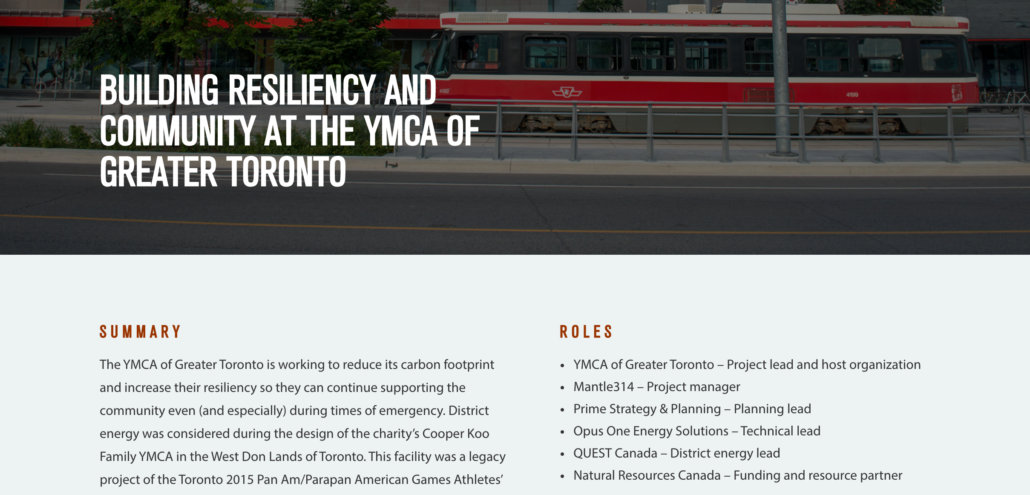
Mantle314 secured a grant from Natural Resources Canada to, in part, develop a knowledge-sharing website about resilient, low-carbon district energy. As the lead project manager and user-experience designer, I was brought in to take the idea from concept to reality.
Despite being a key policy tool to reduce greenhouse gasses in the heating and cooling of buildings, district energy is an underused policy tool. In Canada, there is no main location to share resources, tips, success stories, or promote the solution to developers, politicians, policy analysts, and the general public.
As the leading community energy advocacy organization in Canada, QUEST Canada agreed to host the site to help promote district energy. Embedding the district energy web content on QUEST’s website ensured a broader collection of key decision-makers will be able to access the information, and the information will be kept up-to-date and sustained over many years.
Research suggests targeting developers
As part of the discovery process, I interviewed over a dozen district energy stakeholders, including planners, municipal officials, engineers, strategists, federal scientists, district energy corporate leaders, developers, and advocates. I researched primary and secondary documents, as well as completed a detailed competitive analysis to both understand the district energy space and digital best practices.
District energy is a collective project
District energy is the production and supply of thermal (hot and cold) energy from a centralized plant. Resilient systems can help during power outages, like extreme weather, by providing centres of support, with heat and power, for affected communities. It’s also an efficient way to use less carbon-intensive fuel sources, such as solar thermal, heat recovery from sewers, or deep lake water cooling.
District energy requires an entire neighbourhood to switch from independent systems to de-risk and make the system financially viable. As a result of the feedback we received about the importance of the developer community to the successful development of community-based energy systems, the structure of the website was designed to provide content for a) the developer community and b) municipalities and decision-makers. The best-designed systems need customers and the developer community is key to ensuring projects are successful.
Insights revealed that developers did not understand the technology, the benefits, or how to get to success.
Making is simple
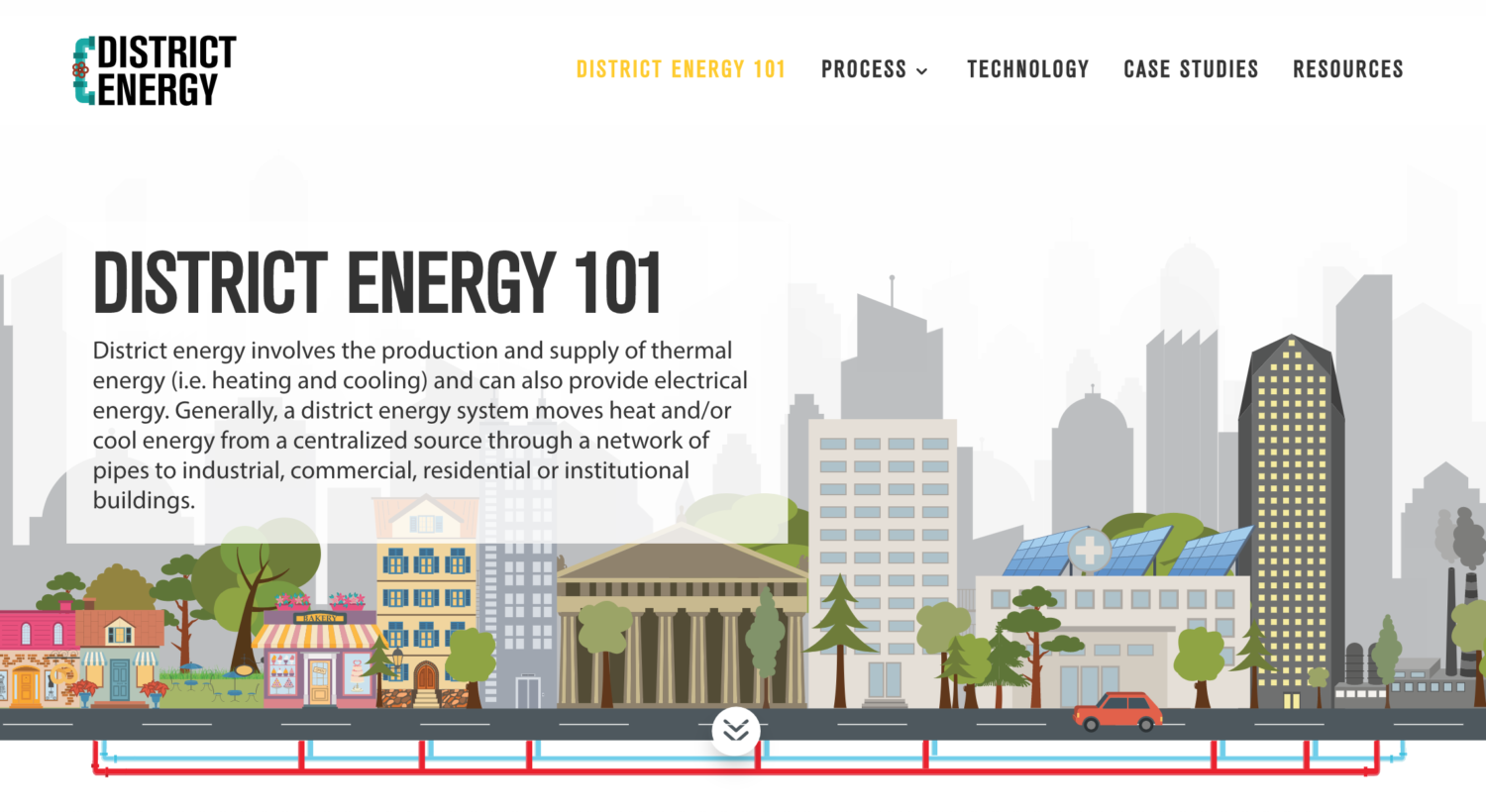
A key insight we heard was that developers avoid district energy systems because they are unaware of the technology and the benefits. On the homepage, we targeted developers with a key marketing message and linked to an easy infographic explanation of the benefits on the District E nergy 101 page.
The District Energy 101 page is an infographic executive summary of the site, breaking down the basics of the technology, and explaining why climate change risks improve the business case for building district energy systems. It also lays out the benefits and explains how to get systems built. This page is an easy entryway to help explain the policy solution.
Demystifying the t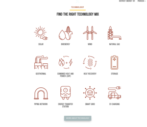 echnology
Another barrier for developers is that they don’t understand the technology underpinning resilient and low-carbon district energy systems. In order to demystify district energy technology, we provided key information about resilient low-carbon energy sources and the various component technology required to operationalize district energy systems. We designed each product page to be like a new smartphone product page to keep it simple while offering key benefits and considerations.
Demonstrating success
QUEST Canada was very happy with its turn-key solution to boost awareness and uptake in district energy systems. The funder of the website, NRCan, also added their support for the modern, yet simple design. Our district energy expert advisory committee was very pleased to have a new tool in their toolbelt when making the case for district energy to government officials, politicians, and developers.
At Sancta Maria House, at-risk young women find a dedicated and diverse staff providing emotional support, understanding, healing, and acceptance in a caring home and then in the wider community.
The charity did great important work in the community but had a dated digital presence. I conducted extensive interviews with the board and staff (to avoid trauma, the residents of SMH were not interviewed). As well, I conducted an environmental scan and competitive analysis to understand how the charity’s competitors were positioned.
Building Trust to Increase Donations
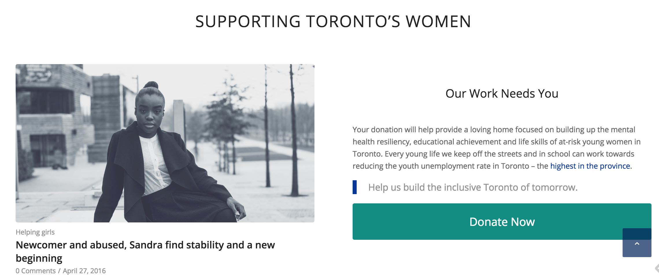
The charity needed a responsive, accessible website, focused on building trust and increasing donations. Their new WordPress website helped explain their services, rooted in care, support, and respect. To attract large donors, I framed their work in a mental health context and for smaller donors, we highlighted success stories.
Success Stories
Through a network of past residents, we captured success stories about some of the young girls they’ve helped.
Testimonials, Staff Photos and an Infographic
To help further build trust, we added the voice of existing donors through testimonials and put a human face to the charity with staff photos. I also created a custom graphic for donors to easily understand their service.
Sancta Maria House was very happy with their site and the professional face it put on their hardworking charity.
Lucalex aides Brazilian businesses move their operation to Canada by helping them navigating cultural, economic and political differences. Lucalex helps free them up to focus on new client acquisition, revenue generation, technical quality and growth.
From a digital perspective, Lucalex had an outdated site and wanted to entice new businesses to contact the company.
Our process
To understand all the dimensions of Lucalex’s issues and opportunities, we:
- Interviewed the CEO,
- Ran a workshop with the CEO to understand Lucalex’s target audience
- Analyzed their business documents and existing communications
- Conducted a competitive analysis to see how similar organizations position their businesses on-line
Our solution
Communicated through a communications brief, a final report, wireframes, and content drafts, we developed a bilingual, modern, and responsive website, with an interactive feature, geared towards building trust and lead generation through a content-marketing funnel.
Here are the wireframes (homepage) and static content I developed.
Content marketing funnel
To help generate leads, we developed personas of the prospective clients at different engagement levels.
Top of the funnel
At the top of the funnel were Brazilian businesses with a low understanding of why developed markets are different than developing markets and unaware of Canada as viable option over the U.S. as a good place to do business. The businesses were, nevertheless, wanting to expand their business and most likely looking to Florida, but were also considering the European Union.
To capture this group, I developed for the Resources section blog posts:
- Toronto, Canada: Educated, safe, diverse and the best place to live, and
- Top reasons to set up your business in Canada
As well, I developed an article on how customer centric business was the required way to do business in highly competitive developed markets (the client opted not to publish it yet).
These general articles, geared towards Brazilian businesses, were used to position Canada as great place to do business and the customer centric article hinted at how Lucalex’s service is required in today’s competitive market.
Mid-range in the funnel
The next group had a strategic interest in North America, understood how developed markets were different than developing markets, but need a push to understand why Canada was the best option.
For this group, I developed infographics:
- Why Canada Offers Ideal Access to the US Market, and
- Move Your Business From Brazil to Canada: A Roadmap
The infographics are only visible by providing your email to Lucalex to help generate leads for future business. Also for this group, an ebook is planned to be used in a similar fashion to take an in-depth focus on why piloting your North-American business in Canada makes sense.
Bottom of the funnel
The bottom of the funnel focused on business understands a developed market economy and is ready to move to Canada, but needs to find the right support.
The general content on the site was designed to attract this target audience, including the interactive feature highlighting lucalex’s unique service, quotes from businesses recommending Lucalex, clearly defined services and calls-to-action to contact Lucalex today.
Interactive feature
Using the a combination of a stock photo, minor overlay of graphics, and the theme’s image with hotspots feature, I developed an interactive infographic to showcase how Lucalex differentiates itself from its competitors and adds value for firms looking to set up in Canada.
Recommendation quotes
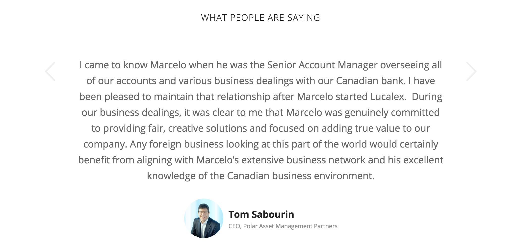
We sought recommendation quotes from businesses who have worked with Lucalex to help build trust with those looking to do the same. In Brazil connections are important, this will help some users take that next step and reach out to Lucalex.
Clearly defined services
We worked with the client to refine and distill their offerings to ensure their users understood what work the company performed.
Result
Lucalex was very happy with their modern, responsive website geared towards generating leads and building trust. The site looks professional and modern, while the content-marketing funnel is tailored to attract Lucalex’s target audience.
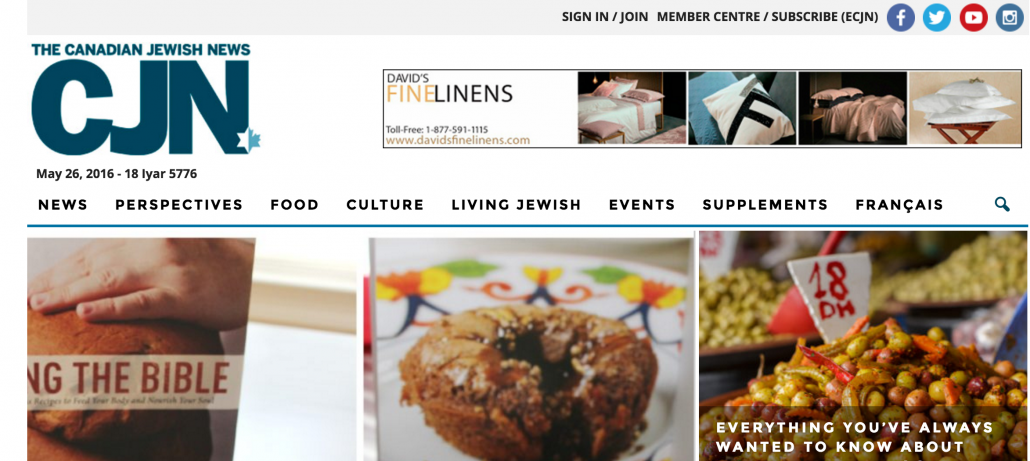
The Canadian Jewish News is the leading voice for Canada’s Jewish community with a strong print subscription community but had an outdated website. Recognizing the future is not in print media, the CJN leadership sought help from Analytical Engine Interactive to re-imagine their digital presence and business model.
CJN’s core problems
The CJN had two main problems that were tactical and strategic.
- Tactical: The site was not delivering an engaging user experience, the backend was complicated, the design did not keep pace with their competitors, and the site did not monetize their content effectively.
- Strategic: Print media is in decline and the ad revenue from CJN’s online content is not enough to support their content-delivery business. The CJN’s print readership – and core subscription revenue stream – skews elderly, creating uncertainty about the future.
Our process
To understand all the dimensions of CJN’s issues and opportunities, we:
- Interviewed board and staff members,
- Ran a workshop with senior leaders to understand – through a card sorting exercise – the CJN’s identity,
- Analyzed their content and analytics,
- Conducted a competitive analysis to see how print media organizations had transformed their business model in the digital space and to see how CJN’s competitors operated online,
- Created profiles of four types of users, and
- Ran usability testing of the old site with CJN readers to identify specific navigation and information architecture issues.
We did not develop the site.
Our solution
Communicated through a communications brief, a final report, wireframes and business and technical requirements, we recommended the CJN build a news website to deliver content through a personalized user experience and expand their business model from strictly content delivery to providing utility.
Personalized user experience
To align with trends in mobile consumption and digital content delivery, CJN had to transition to a user platform that prioritizes their reader’s content interests rather than only serving up articles. We wanted them to use personalization to drive relevance among the CJN’s readers and create a user experience that is unique, tailor-fitted, and deeply personal. Not only will this fulfill the CJN’s community-building role, but also remain relevant in an increasingly saturated digital content market.
To understand personalization for users, we needed to understand their readers/users.
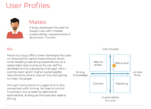
Using insights from user interviews, we found four types of CJN audiences and what issues or content would matter to them. While the community cannot be distilled into these four archetypes, it offers a decent sampling of the audience the CJN must think of when writing news articles and providing utility. As well, these users will help determine the appropriate visual design to ensure the site aligns with the identities of its users.
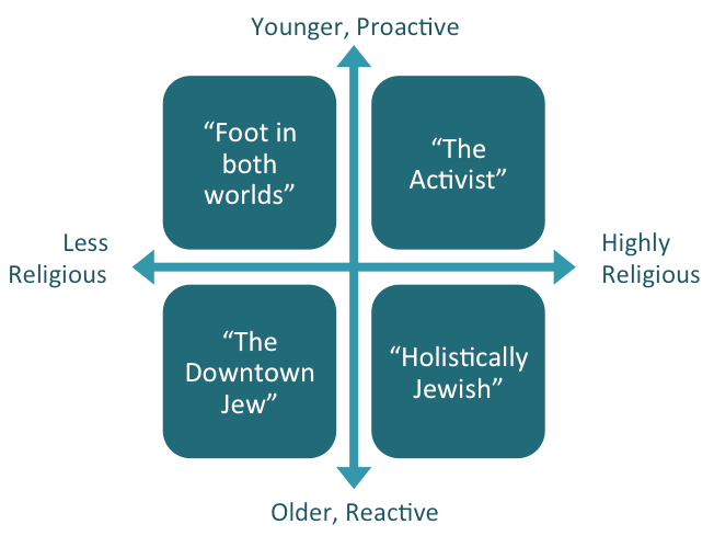
- Foot in both worlds user is digitally savvy and identifies with being Jewish but isn’t too attached to the idea or essence of being a Jew.
- The activist user is the youngest user, gets most of her news online and from social networks, and a strong advocate for Jewish issues, who and seeks out opportunities to engage Jews in dialogue and debate.
- The downtown Jew identifies as Jewish but isn’t too attached to being Jewish. They are is in their 40s or 50s, enjoys attending events of interest to the Jewish community, and tends to have a fairly liberal perspective in life (and politics). They get news about the community both in print and digital formats.
- The holistic Jew considers being Jewish the source and summit of their identity. A deeply devout elderly Jew, they are someone who unfailingly observes the Jewish calendar, is emotionally invested in their community, and holds profoundly conservative views. They get their news primarily from television or radio but can also go online when needed.
Providing utility
To adapt to the changing media and advertising landscape, CJN had to transition from a content-delivery service to a platform that provides a unique utility to engage users and increases revenue generation.
The newspaper industry is now generating profits equivalent to what it made in the 1950s — $20 billion USD annually down from $60 billion only a decade ago. Though Canadian Jewish News was late to the transformation, it is not that far behind the ethnic and community newspaper industry.
An upside of the delay in transforming is the wealth of alternative revenue generating models tested by other media organizations.
Alternative models
As the quest to return to profitability has forced traditional organizations to re-invent their business, the democratization of publishing technology has enabled digital up-starts to rise up using new business models, resulting in a plethora of new revenue-generating models.
The new digital models to reinvent the content-delivery business we analyzed include:
- Full or partial pay walls for content
- Selling goods and services to an educated, affluent, and politically active subset of the population, such as the products you review, industry analysis, digital marketing services, classes and events
- Creating multiple digital products to maximize revenue
- Sponsored content, including column, post or feature produced externally or internally
- Crowd funding public-service journalism
- Becoming a non-profit society to solicit donations
Results
The n ew CJN website launched last October 2015 and has been fully responsive ever since. It was a huge leap from its former fixed-width design and is now capable of being viewed on both desktop and mobile devices.
There are still some features in development to provide utility such as a recipe bookmarking service, a Jewish business directory and CJN events program. We at Analytical Engine Interactive are delighted to know that they are happy with the website we delivered and would love to see the editorial team grow this site to a responsive, utility-driven, and deeply personal user experience.
The Peer Project helps at-risk and newcomer kids meet their full potential through their unique peer-mentoring service. The service and help they provide kids is great, but their site was in need of a serious refresh.
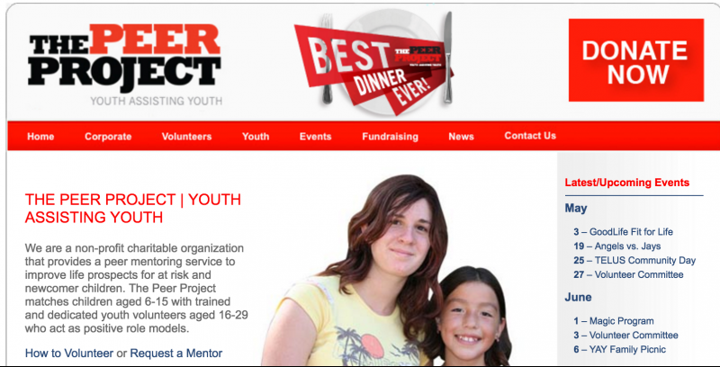
The Peer Project’s core problem
The website did not look professional to attract their two main target groups: donors and volunteers to become mentors.
Our process
To understand The Peer Project’s issues and opportunities, we:
- Interviewed mentors, and board and staff members,
- Analyzed their content and analytics,
- Conducted a competitive analysis to see how other charities positioned their organization on-line
- Created profiles of their two target users — donors and potential mentors — to help shape the content.
Here are the wireframes and site content I developed.
Our solution
The Peer Project got a fully responsive website with a new mentors toolkit section that allows mentors to search for events they can attend with their juniors organized by age, and a new volunteer sign-up system for mentors that frees up hours of staff time every week. And, we created custom graphics for donors to increase transparency and encourage donation.
Attracting donors
To attract donors, we linked the organization’s success stories, which I captured through interviews, with their donation appeal. Donors would see the junior’s success through mentoring and be encouraged to make a donation.
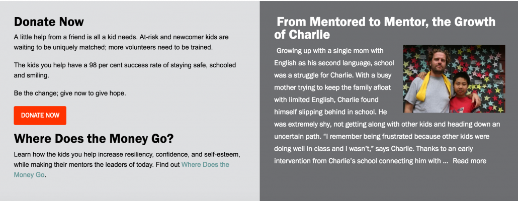
 To give donors a high-level understanding of the unique matching, training and support The Peer Project offers, we also commissioned an infographic, based on my script, highlighting how donations help the organization. The infographic tells the organization’s story through images with simple explanations.
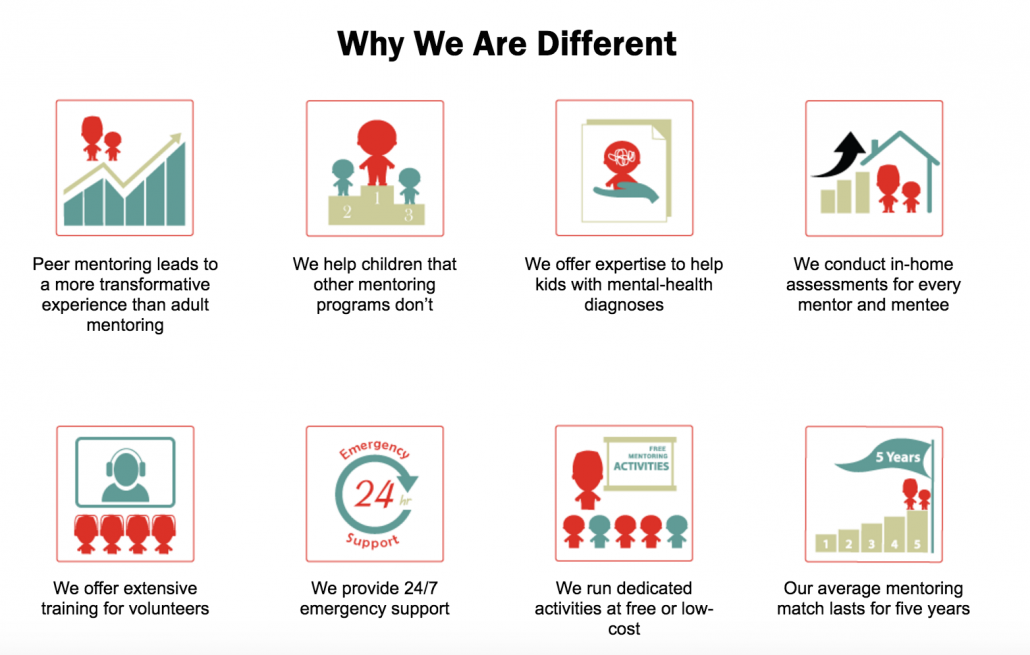
To help sponsors (and mentors) understand the unique value The Peer Project offers that also differentiates it from other mentoring services, we created customized icons highlight how the organization is different.
We also developed a Sponsors page to highlight and thank The Peer Project’s donors and partners. The page also links to the Peer Project’s community stories to provide prospective sponsors with a view into the Peer Project’s great work helping at-risk kids.
Attracting Mentors
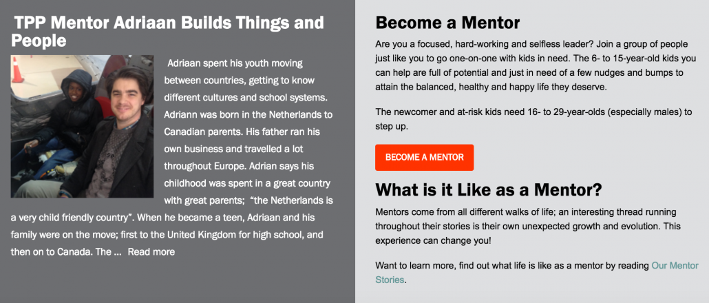
To attract mentors, we linked the organization’s mentor success stories, which I gathered through interviews, with their volunteer appeal for more mentors.
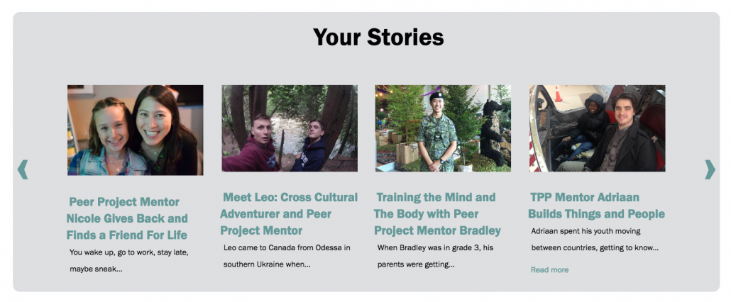
To help build the mentor community and promote the community to prospective mentors, we built a mentor’s toolkit page to provide mentors a space to showcase their stories, find support, discover events and connect on social media.
Result
The Peer Project is happy with their new site focused on attracting donors and mentors. The new responsive scrolling website is extremely easy to use for employees and has meant that they will save hundreds of dollars every month on what used to be external content management costs. The stories about their mentors and kids provide them with a strong identity demonstrating their value to potential donors and mentors.

