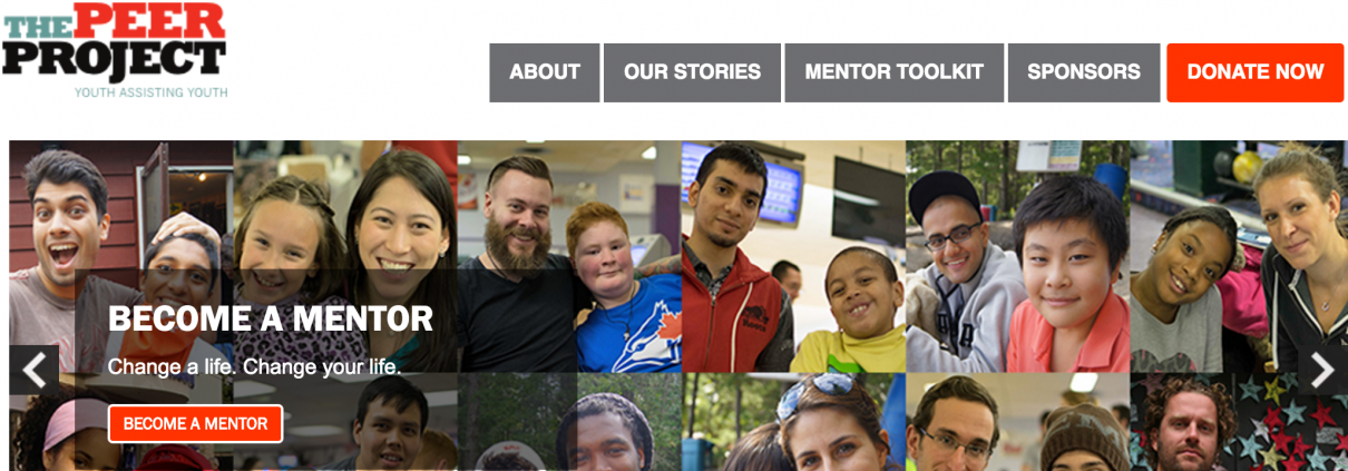
The Peer Project helps at-risk and newcomer kids meet their full potential through their unique peer-mentoring service. The service and help they provide kids is great, but their site was in need of a serious refresh.
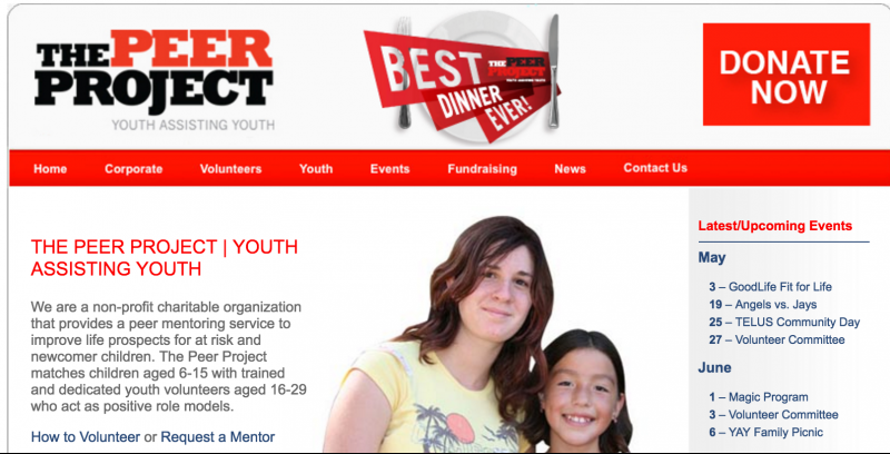
The Peer Project’s core problem
The website did not look professional to attract their two main target groups: donors and volunteers to become mentors.
Our process
To understand The Peer Project’s issues and opportunities, we:
- Interviewed mentors, and board and staff members,
- Analyzed their content and analytics,
- Conducted a competitive analysis to see how other charities positioned their organization on-line
- Created profiles of their two target users — donors and potential mentors — to help shape the content.
Here are the wireframes and site content I developed.
Our solution
The Peer Project got a fully responsive website with a new mentors toolkit section that allows mentors to search for events they can attend with their juniors organized by age, and a new volunteer sign-up system for mentors that frees up hours of staff time every week. And, we created custom graphics for donors to increase transparency and encourage donation.
Attracting donors
To attract donors, we linked the organization’s success stories, which I captured through interviews, with their donation appeal. Donors would see the junior’s success through mentoring and be encouraged to make a donation.
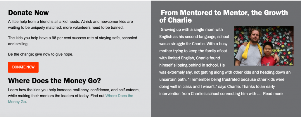
 To give donors a high-level understanding of the unique matching, training and support The Peer Project offers, we also commissioned an infographic, based on my script, highlighting how donations help the organization. The infographic tells the organization’s story through images with simple explanations.
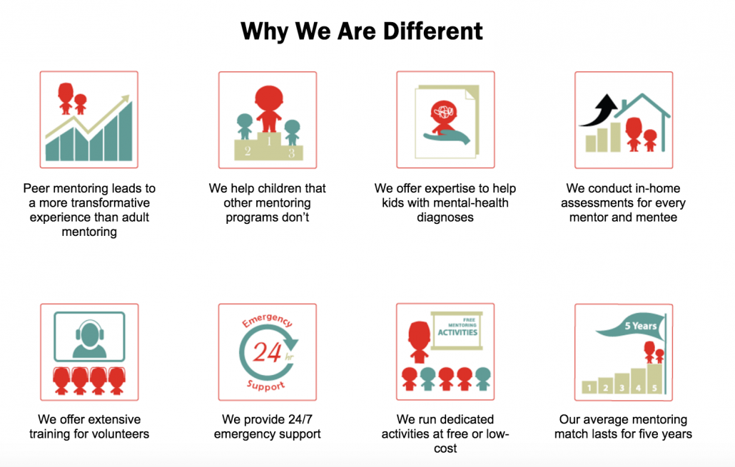
To help sponsors (and mentors) understand the unique value The Peer Project offers that also differentiates it from other mentoring services, we created customized icons highlight how the organization is different.
We also developed a Sponsors page to highlight and thank The Peer Project’s donors and partners. The page also links to the Peer Project’s community stories to provide prospective sponsors with a view into the Peer Project’s great work helping at-risk kids.
Attracting Mentors
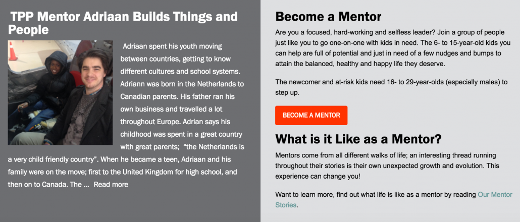
To attract mentors, we linked the organization’s mentor success stories, which I gathered through interviews, with their volunteer appeal for more mentors.
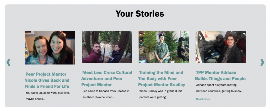
To help build the mentor community and promote the community to prospective mentors, we built a mentor’s toolkit page to provide mentors a space to showcase their stories, find support, discover events and connect on social media.
Result
The Peer Project is happy with their new site focused on attracting donors and mentors. The new responsive scrolling website is extremely easy to use for employees and has meant that they will save hundreds of dollars every month on what used to be external content management costs. The stories about their mentors and kids provide them with a strong identity demonstrating their value to potential donors and mentors.

